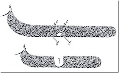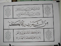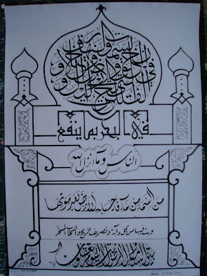
According to Ibn Muqlah, quoted from the book 'Islamic Calligraphy Art' essay Drs. H.D. AR Sirojuddin M. Ag, the form of calligraphy that al-Quran is considered correct if then meet five criteria as follows:
1. Tawfiyah (right), the letter should have scratches in accordance with the stroke portion in full, good curve, kejuran, and elbow.
2. Itmam (complete), ie each letter should be given a full size, good length, short, thick and thin.
3. Ikmal (perfect), the sweep of each stroke must be in accordance with the beauty of a reasonable, good style upright, supine, and play the curve.
4. Isyba '(solid), the sweep of each stroke must be fit from the touch pen (nib pen) so that the harmonic form. Thus the imbalance will not occur, one part looks too thin or too thick from the other, except in areas that touch so wish.
5. Irsal (smooth), the carve Kalam quickly and precisely, does not stumble or restrained so that the baffle, or strike in mid-stroke, giving rise to vibration at the end of the damage any posts that are digoreskan.
Furthermore, Ibn Muqlah formulate all discounted in the standard letter that the letter alif digoreskan in the form of vertical, with the size of some special point of rhomb ditemuka to start from the top down ( 'amadiyyan, vertex to vertex), and the number of dots in accordance with party-colored shapes , from five to seven points. Standard circle has a radius or distance that is the same as the alif. Both standard and alif terebut circle is also used as a basic form of measurement or geometry. This is called the formula or calligraphy berstandar (al-al-mansub line) in accordance with the principle that raw materials and standardization of guidelines to be pure calligraphy writing.
Control of this formulation of adaptation that takes a long time. Therefore, diligence to always try and try even though the error is found often control the dynamics of handwriting. This business should continue to do so can teradaptasi direct reflection of the formula, the form of letters, dots, line scale, and so forth. Try to see the picture below.

The layout is good (husn al-wad'i), according to Ibn Muqlah require improvements to the four cases, among others:
1. Tarsîf (and regular meeting), that is precisely the connection with a letter the other. Try to note the following example
Figure 7. Sulus handwriting style

Style of handwriting examples sulus prepared with density above the regular, balanced the distance between the letter, according to the size of a standard convention as the official standardization of the writing.

Next, try to note the style of handwriting examples kufi above. Distance, shape, density, kelenturan, and snippets of letters arranged exactly, symmetry, and proportional.
2. Ta'lîf (regular), the heap of each letter separately (single) with the other in the form of a natural and beautiful. Try to note the example above, the forms of each letter sulus style above is not written in the form of a different, but all the same, good shape, thick thin, high and wide. Uniformity 3 letter ha / jim, located in the middle right, bottom, and rise to the impression left upon the beautiful character of the letter. The same 4-letter alif lam.
3. Tastîr (tune, wrong), which connects a word with the other so that the ruler who established the location of a consistent rule (ruler). Try to note sulus example above, how the 3-letter alif lam arranged in parallel. Or see below.

In the example above the order of style between the letters beneath the harmony above the ruler, and tidy.
4. Tansîl (like a sword or spear kerena beautiful), that is putting the wipe-wipe sweep a beautiful letter in each row. Try to see the example below.

In the example above diwany handwriting, wipe or scrape the letter sin syarîfah on the line in the beginning, the kaf single, middle and end of the line in the middle, so the bottom line appears to sweep sabetan as swords, beautiful, but all reasonable shape.
All the beauty that can be arranged with the proportional form of a reasonable, beautiful and if the writing meets the criteria approved. Here is an example of the principle line of script used in many of the manuscripts or texts of the official, approved by the khattat Indonesia, in general, as a first step control principle letter. If the formula / theorem style letters have been mastered, style of handwriting that another letter be also easily

At the top and bottom, there is a similarity in the form of the 'Ain start up a snippet from the top, middle, and bottom. Kesamaam form is due to the ability Syauqy whizbang khattat Muhammad has become the master of Turkish calligraphy. So also the letters of the other.
Meanwhile, in the middle, is the principle naskhi consisting of benuk-benuk variants kaf. While the bottom of the middle column, is a variant form of the letter mim. As explained previously, the criteria of a primary principle that must be mastered khattat, then at each mengaplikasikannya distinctive style of handwriting.


